

By Shivam Das | October 12, 2026
Quick answer: The 2026 Treasure Island adaptation has a strong visual foundation: weathered ships, layered period costumes, coastal locations and atmospheric interiors give the adventure a tangible world. But striking production design cannot solve every story problem. The Guardian’s two-star review and other critical responses argue that added fantasy elements, melodrama and uneven pacing can pull attention away from Robert Louis Stevenson’s original adventure.
The promotional stills below come from Paramount+ UK & Ireland’s official first-look gallery. Image credit: Paramount+ UK & Ireland. Rights remain with the respective owners.
What the production design gets right
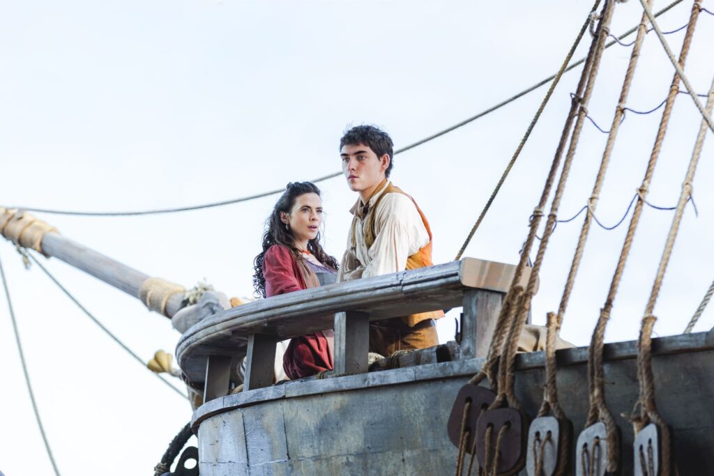
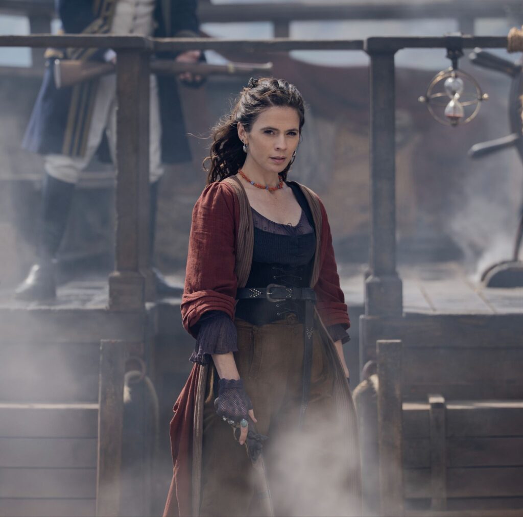
A pirate story lives or dies partly on whether its world feels physically convincing. Ropes, rigging, timber, salt-worn clothing and cramped shipboard spaces can communicate danger before a character says a word. The official first-look images show a deliberately tactile setting: layered fabrics, ship details and muted maritime colors rather than a glossy fantasy theme-park look.
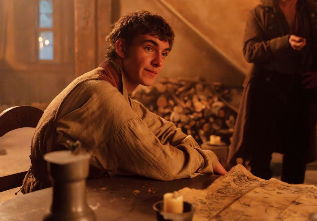
The deck and open-water setting make the journey feel exposed, while warmer interiors create contrast with the uncertainty outside. These are meaningful strengths for a story built around a dangerous voyage and competing claims to a treasure map.

Ships, costumes and atmosphere do important storytelling work
Costume design can quickly distinguish social position, temperament and personal history. Bess Hawkins’ practical layers make her look prepared to act in a difficult world; the more formal maritime clothing worn by other figures suggests hierarchy and authority. The contrast helps the audience read relationships even when the script is introducing new plot mechanics.
Shipboard staging matters just as much. A vessel is not simply a picturesque backdrop in Treasure Island: it is a confined space where alliances can change and escape routes are limited. Rigging, railings and narrow working areas can make confrontations feel immediate. When a production uses these spaces well, suspense comes from geography and character choices—not just music or rapid editing.
Where the visuals meet the script problem
The Guardian’s Sarah Dempster gave the series two out of five stars on October 12, criticising its added superpower concept, Jim’s photographic memory, heightened family drama and other departures from the novel. The review also singled out David Oyelowo’s Long John Silver as a compelling presence, while arguing that his performance could not rescue the broader story.
That distinction matters. A production can look expensive and carefully made while still feeling narratively overworked. If a scene pauses to explain a new ability, a flashback or an extra conspiracy, the visual world may remain attractive but the forward momentum can weaken. For viewers who come for a tale of loyalty, greed and survival, every additional device needs to earn its place.
The A.V. Club’s October 12 review also described the adaptation as uneven: it praised the sets and dynamic direction while questioning whether the new choices justify themselves. The useful debate is not simply whether the show is beautiful or bad, but whether the design and camera work deepen the story—or merely decorate it.
David Oyelowo’s Long John Silver gives the world a focal point
One clear point in the early criticism is that Oyelowo brings weight to Long John Silver. His performance gives the character danger and watchfulness, helping scenes feel less like a costume exercise and more like a meeting with someone whose motives cannot be trusted. The weathered clothing and parrot create an instantly recognisable silhouette without explaining everything about him.
Yet a strong central performance can expose the imbalance around it. If Silver feels vivid while Jim is pushed into the background, the adventure risks losing the young protagonist’s curiosity and agency. Production design can frame that imbalance, but the script must give Jim consequential decisions and let the audience experience the story through him.
How the series compares with the spirit of the book
Robert Louis Stevenson’s 1883 novel is not valuable only because it contains pirates and treasure. Its suspense comes from a young person learning to judge adults whose charm may conceal greed, fear or betrayal. Adaptations can change details, expand supporting characters or reinterpret history; the question is whether those changes preserve the pressure at the heart of the story.
The series gives Bess Hawkins a much larger role than she has in the novel, creating an opportunity for a fresh perspective on the family’s struggle. But when added subplots compete with Jim’s journey rather than sharpening it, viewers may feel that the adaptation has traded emotional clarity for constant escalation.
For context, read Paramount+ UK & Ireland’s official Treasure Island guide and TV Insider’s interview with Hayley Atwell and David Oyelowo.
Watch the official trailer
The official trailer offers a look at the production’s ships, costumes, color palette and action style. Promotional footage is useful for seeing the design, but it is not independent evidence of the show’s quality.
Verdict: beautiful surfaces, but story comes first
The production design gives this adaptation a convincing maritime texture, and its strongest performances benefit from that carefully built world. The criticism is not that the series lacks visual ambition. It is that extra powers, heightened melodrama and an expanded plot can distract from the leaner adventure that made Stevenson’s novel endure.
For viewers who value atmosphere, costumes and a darker take on Long John Silver, the series may still offer reasons to watch. For book purists, the bigger question is whether the changes deepen the original themes or simply add noise. The balanced conclusion so far is that the show’s craft deserves recognition, but its storytelling has to do more than look the part.
Frequently asked questions
Who created the production look of Treasure Island (2026)?
The series was created for television by Robert Murphy and produced by Playground in association with Paramount+ and MGM+. For individual department credits, consult the programme’s official credits rather than guessing.
Why are critics divided about Treasure Island?
Early reviews acknowledge visual craft and David Oyelowo’s performance but criticise the added fantasy elements, melodrama, pacing and reduced focus on Jim Hawkins. Viewers who welcome a radical reimagining may respond differently from readers seeking a closer adaptation.
Does the series follow Stevenson’s novel closely?
This version makes conspicuous changes, including a much larger role for Bess and a photographic-memory concept for Jim. Whether those changes work is a matter of execution and taste.
Where can viewers watch Treasure Island?
Paramount+ UK & Ireland announced the series for its service from October 12, 2026. Availability varies by country, so viewers should check their regional streaming service.
Are these AI-generated images?
No. The stills are hosted in Paramount+ UK & Ireland’s official first-look gallery. They are promotional images, not AI-generated; reuse should comply with applicable rights and terms.


